CASE STUDY
CLEVELAND CLINIC LIBRARY WEBSITE

Redesign Process
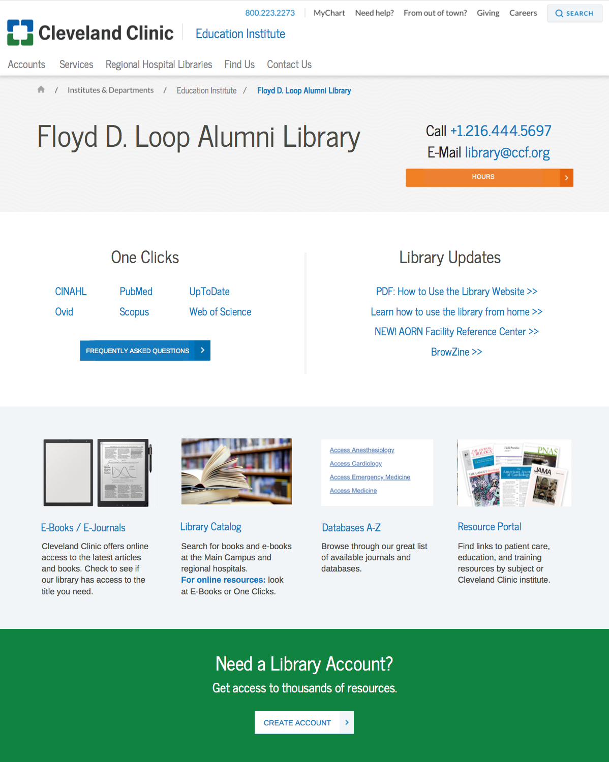
A Glance at the Final Product
Team:
-
Internship and User Experience Mentor: Laura Greenwald, Cleveland Clinic Education Institute Communications Manager
-
Library Website Mentor: Marian Simonson, Cleveland Clinic Library Assistant Director
-
Isabel Wang, Website Usability Intern
Project:
Cleveland Clinic Library Website Redesign
Timeline:
June 2018 - August 2018
My Roles and Responsibilities:
-
User Experience Designer
-
User Experience Researcher
-
User Interface Designer
Necessary Skills:
-
User Experience Research
-
User Testing
-
User Flow
-
User Interface Design
1. Problem
2. Testing
3. Solution
Internship Task
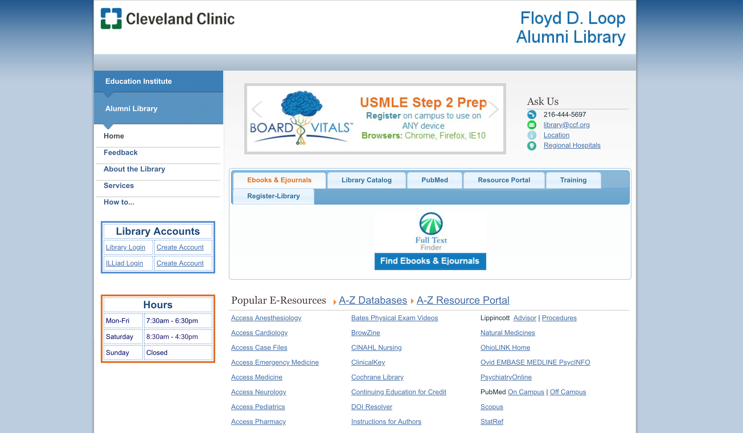
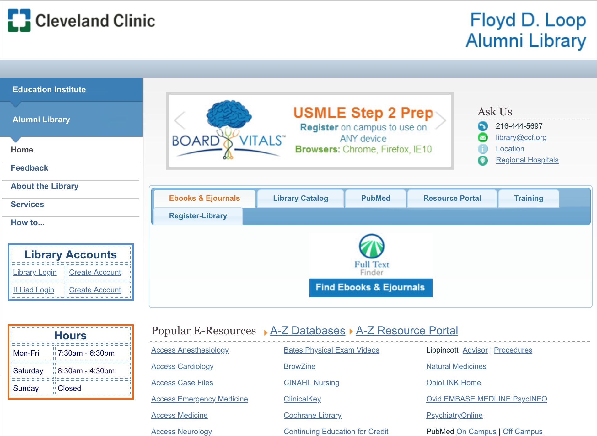
The original website had a great color scheme for its purpose. Blue creates feelings of trustworthiness, orange captures attention, and white brings a clean feel to the website. The contact info was commonly needed by visitors, so it was located at the top right of the main page. The old site also intelligently utilized the main space for quick links to commonly searched items.
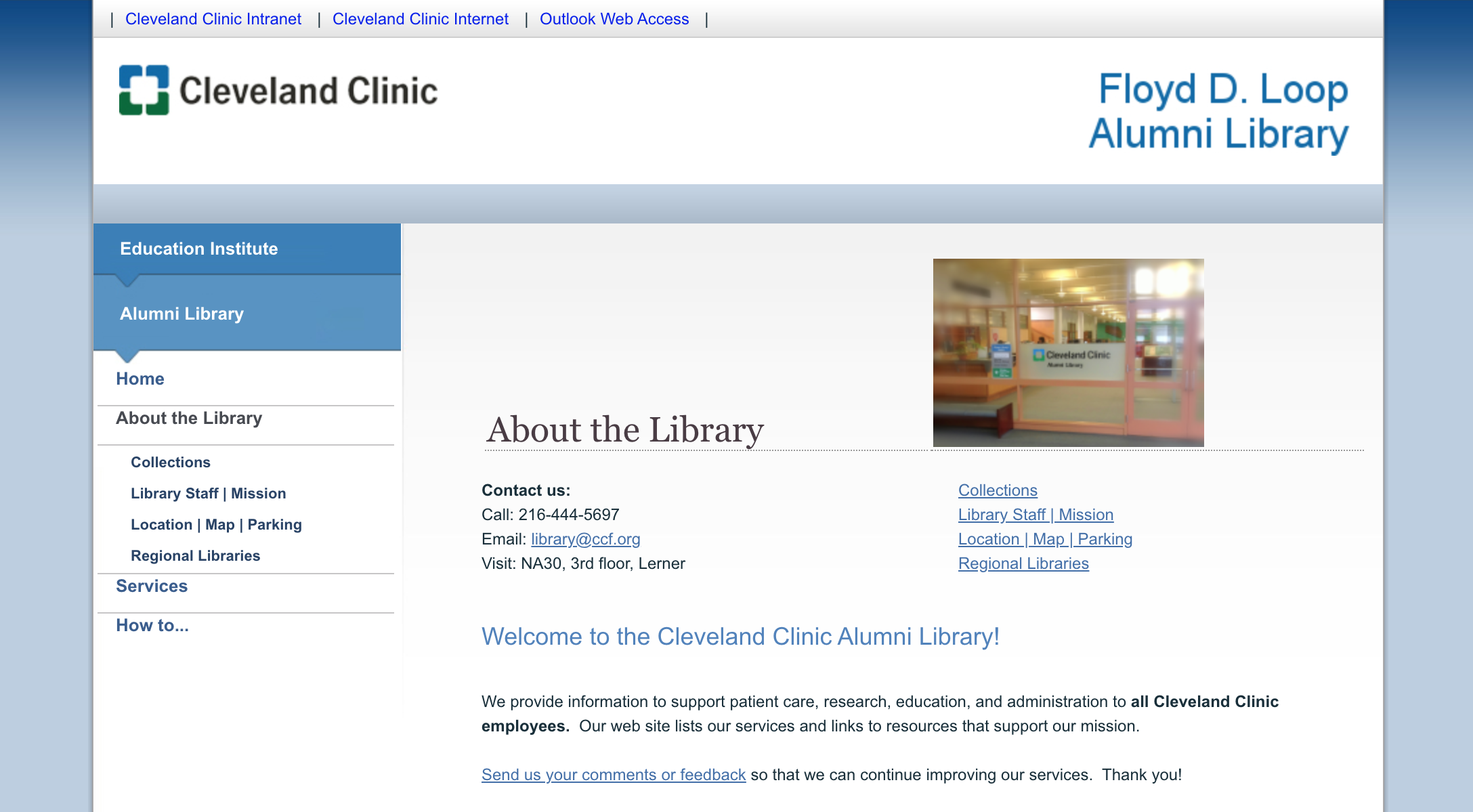
However, its navigation was confusing, especially when discerning between the resources within Ebooks & Ejournals, Library Catalog, Resource Portal, and Databases. A few of the main tabs led to external websites while a few led to internal pages, causing additional confusion and preventing the user from easily predicting navigation outcomes. Finally, there were so many resource hyperlinks that reading became tedious and the website was not intuitive, leading to frustrated users needing help from busy library staff.
Another interesting aspect of this project was that our team was in the process of moving the old DNN website to a different server. In order to do this, we had to incorporate new design features that would work well with the transfer.
My task for the summer was to completely redesign this library website through design knowledge, user experience research, and usability testing with focus groups.
Market Research
As an avid library borrower, I had a pretty good idea of what some people may look for when visiting a library website. Still, in order to begin conceptualizing the library website redesign, I had to find inspiration through concrete examples.
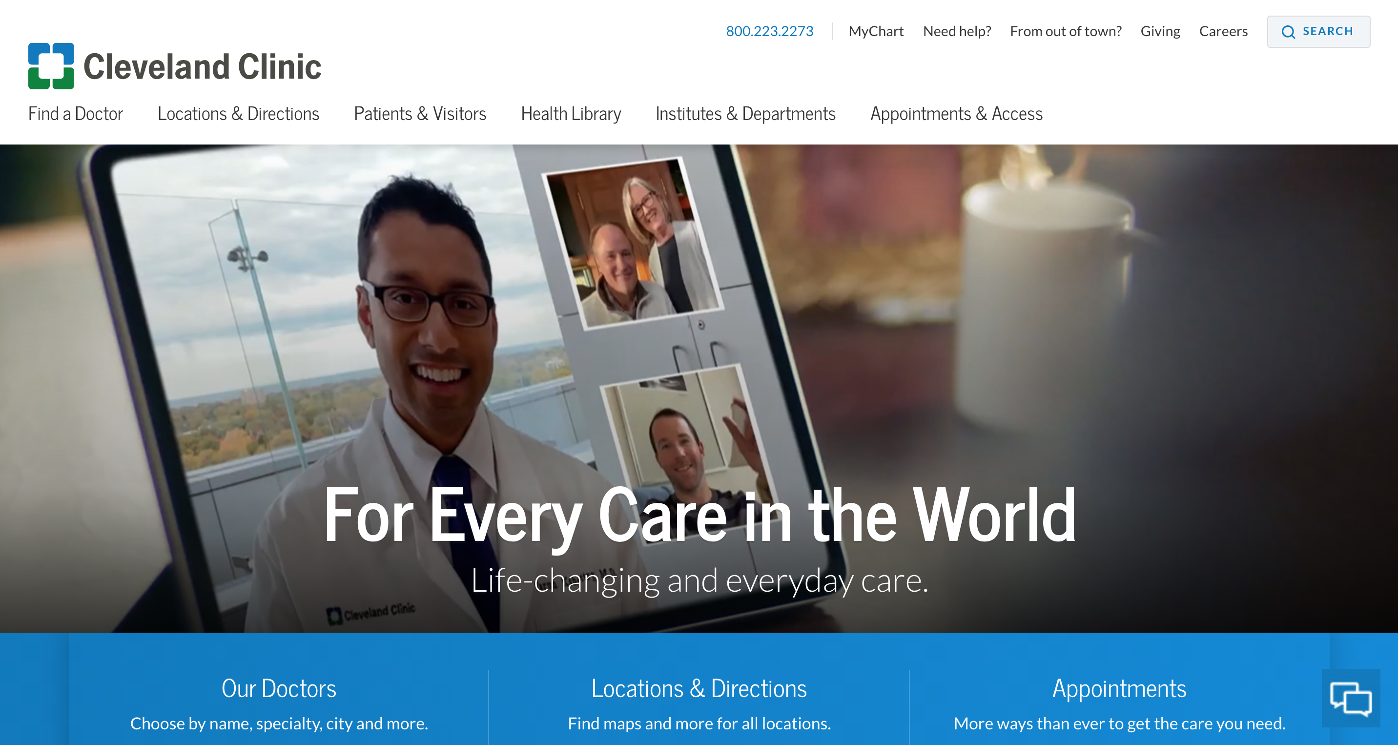
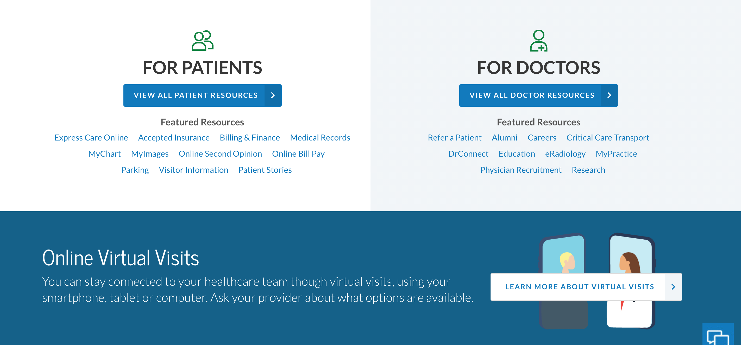
First, I analyzed the main Cleveland Clinic website. It looked clean, yet friendly, and much more modern than the old library website. This modern feel was due to expertly used space, filled with photos, graphics, large text, and intuitive navigation. I took into account the color scheme: blue, white, and green all over the website, modeled after the logo in the top left corner. Additionally, header navigation was simple and easy to understand, in stark contrast to the old library website navigation. I used this main website as design inspiration and pulled bits and pieces of it (such as buttons, fonts, colors, columns) for use during the redesign.
Second, I revisited my local library's website. I appreciated that the search bar was the first feature on the site, since I always searched for a book title or author to check its availability and either borrowed it or put a hold on it when using the website. I also noticed that my local library's website featured library card information, a link to its events, and images of new book arrivals. The main reasons for visiting the website were represented on its main page.
Usability Testing and Survey
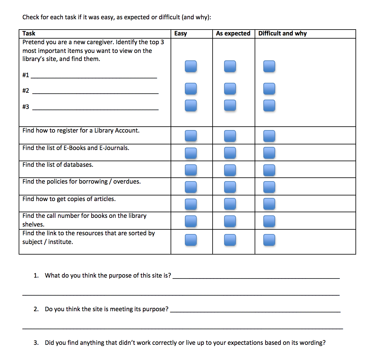
In order to understand our library website users, we chose to hold a focus group for usability testing with residents, medical students, doctors, and administrative staff. By scheduling a full day in a computer lab, I was able to watch as users navigated through each main task and teach people about our project. I then sent the user survey by email to staff members that were not able to attend, and we asked the administration Communications team for input on website features that needed improvement.
With website usability data analysis from Google Analytics, the focus group, and the survey, along with meetings with my mentors, I found that the most important and frequently visited areas of the website were the e-books, online resources, contact information, library services, and patient care recommendation resources, such as UpToDate and Lexicomp. This finding motivated me to feature these areas prominently on the main page. My user experience research influenced all of my design decisions.

User Experience Research
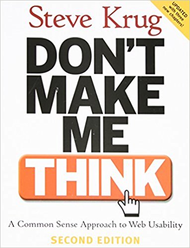
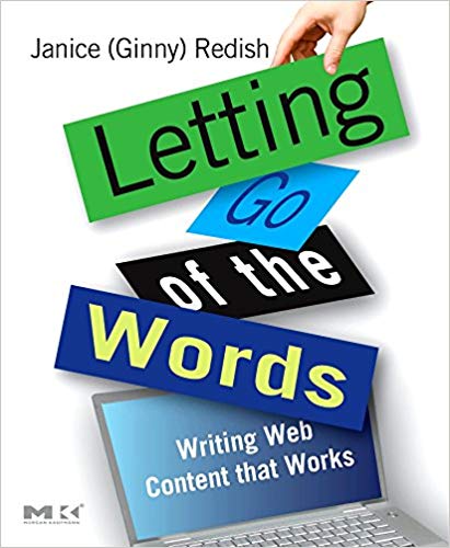
On my first day at work, my mentor handed me two books, Don't Make Me Think and Letting Go of the Words. It was important that I learned from user experience experts before designing. Beyond books, I used online resources such as blogs and newsletters to learn about best practices and user experience myths. My mentor and I even attended a local User Experience Professionals Association event. I delved into website usability and implemented the material in my design process.
These were my favorite UX ideas:
-
Every main reason why people visit the site should be accessible within 3 clicks to new pages. People are happier to scroll than click to a new page.
-
Limit the number of choices on a page to 7, since people have difficulty processing more items.
-
White space is counterintuitively good, and usability should take precedent over aesthetic.
-
The homepage must exemplify the group's identity and mission.
-
People tend not to read the website's small text until arriving at their final page.
-
Navigation should be obvious, as people are impatient online.



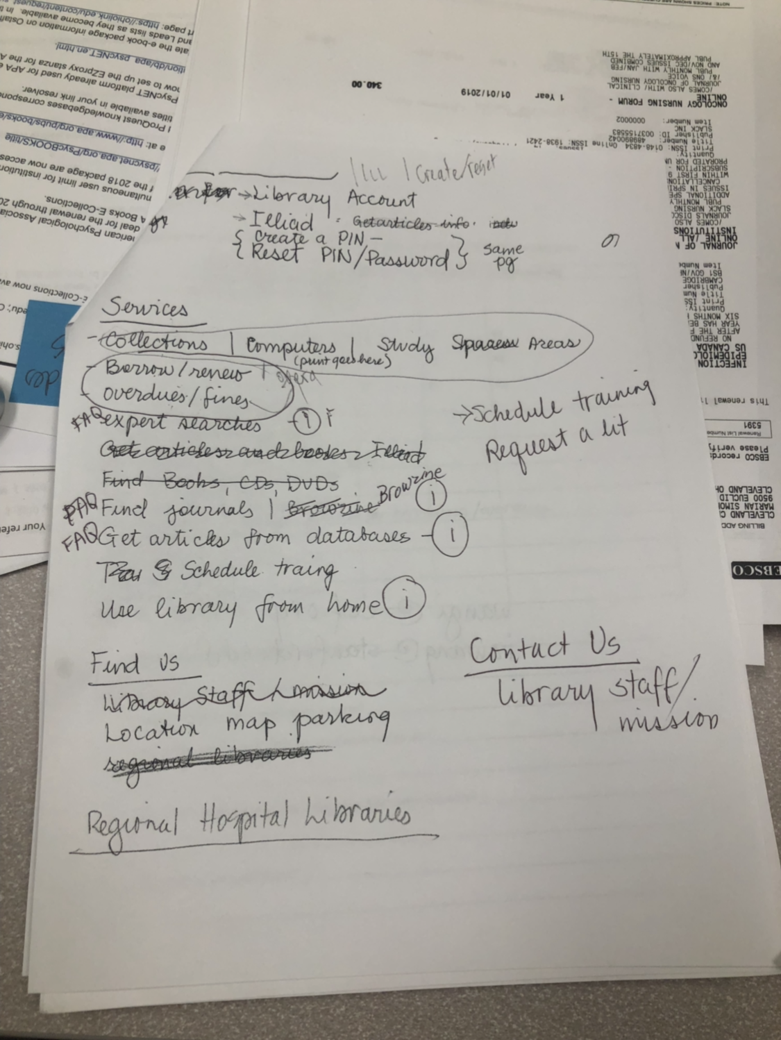
Focus Group Suggestions

Additional Ideas
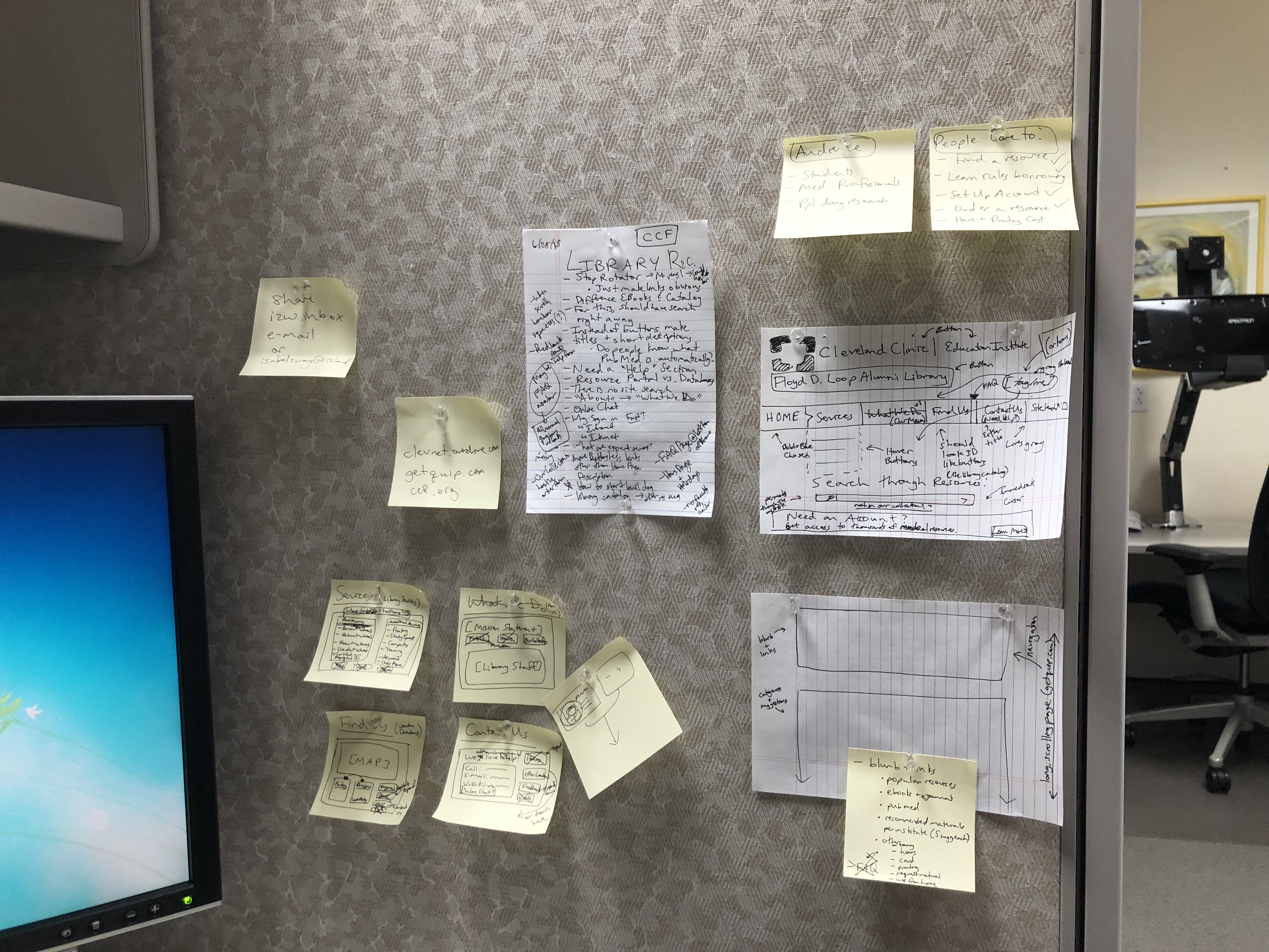
Low Fidelity Wireframes
-
Add Contact, Location, and Policies tabs for navigation
-
Important text should be larger
-
Update how-to information about searching for online resources from the external links
-
Organize resources and services
-
Create downloadable directions PDFs for the Find Us page
-
Add Tip Guide and FAQ sections
-
Update information about different forms of borrowing
-
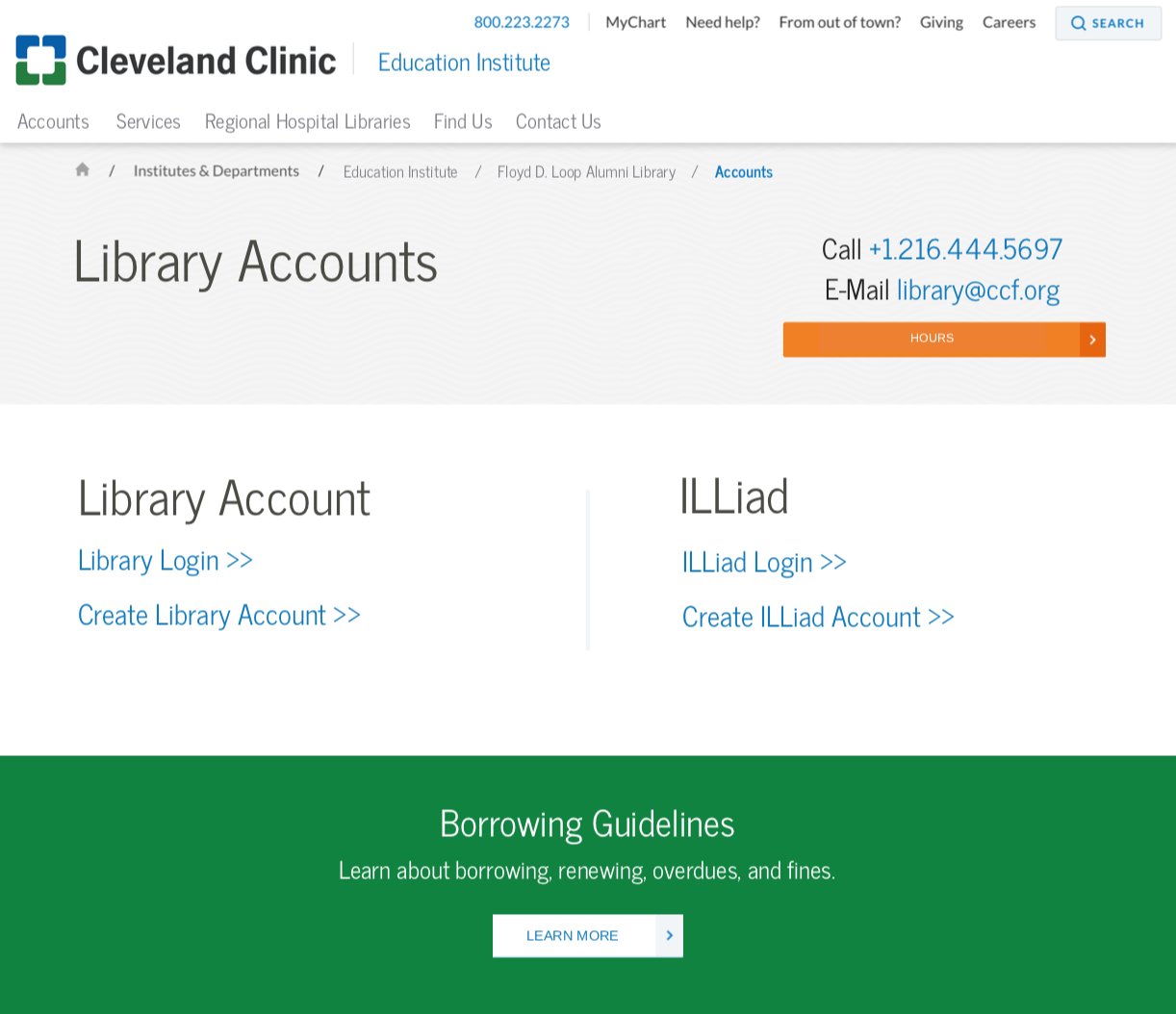
Edit Library Accounts user flow
-
Remove repeating information
After conducting user experience research and consolidating important suggestions from the user surveys, I sketched the new website's user flow and low fidelity wireframes to place each necessary website section.
Final Design
I redesigned the website into a modern, calming, clean, and user-friendly interface. Importantly, I used user experience research to improve the website usability so that links were either intuitive or had descriptions to help with navigation.
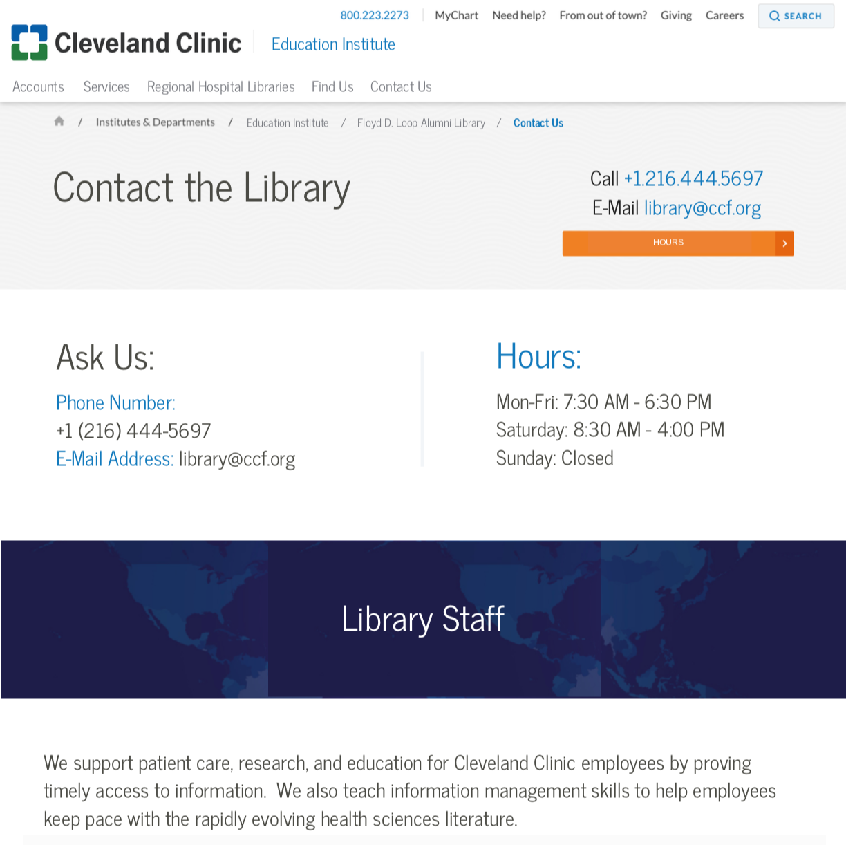
By taking wireframes from low fidelity to high fidelity, I incorporated the Cleveland Clinic branding and general design guidelines, such as colors, fonts, and header styles. I took pieces from the other Cleveland Clinic pages, such as section bars, in order to make the entire website cohesive. I highlighted important information that people seek on each page with colored buttons and large text. I redesigned the user flow of the entire library website, including the process of signing into an external account. Through this process, I was able to incorporate the users' suggestions into an aesthetically pleasing and user-friendly final product.
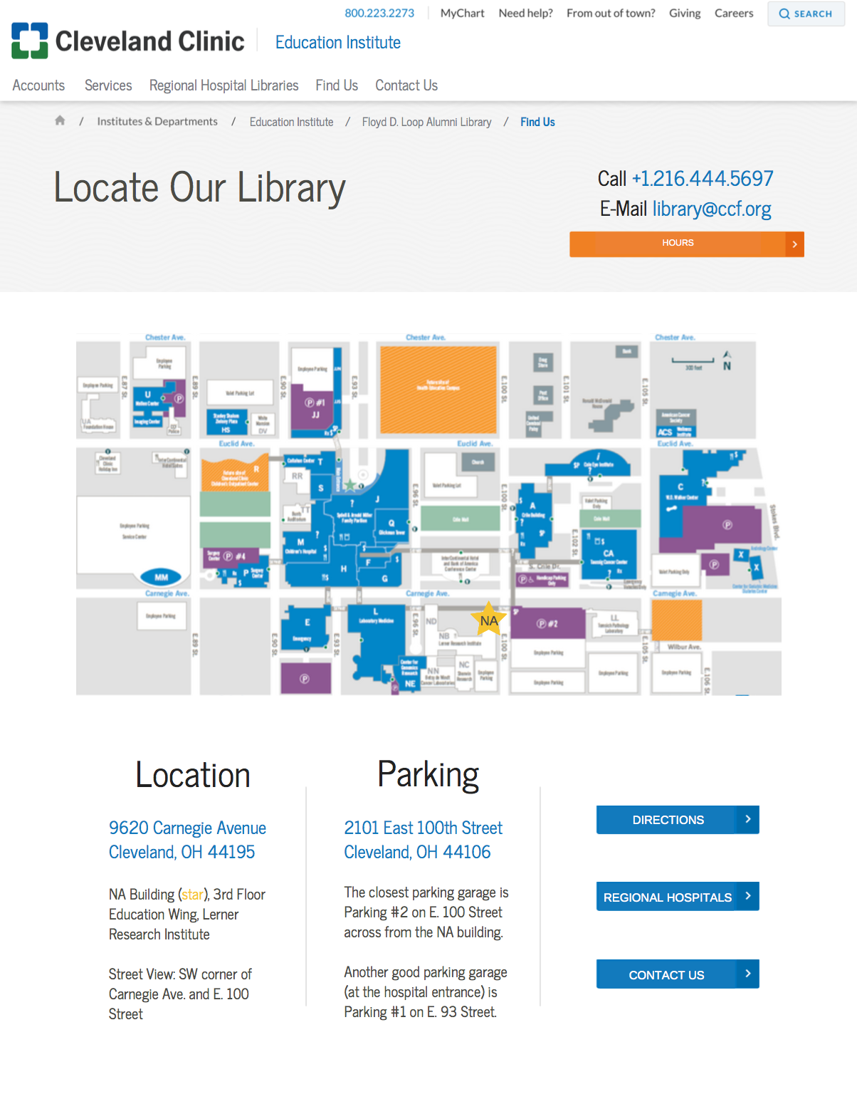
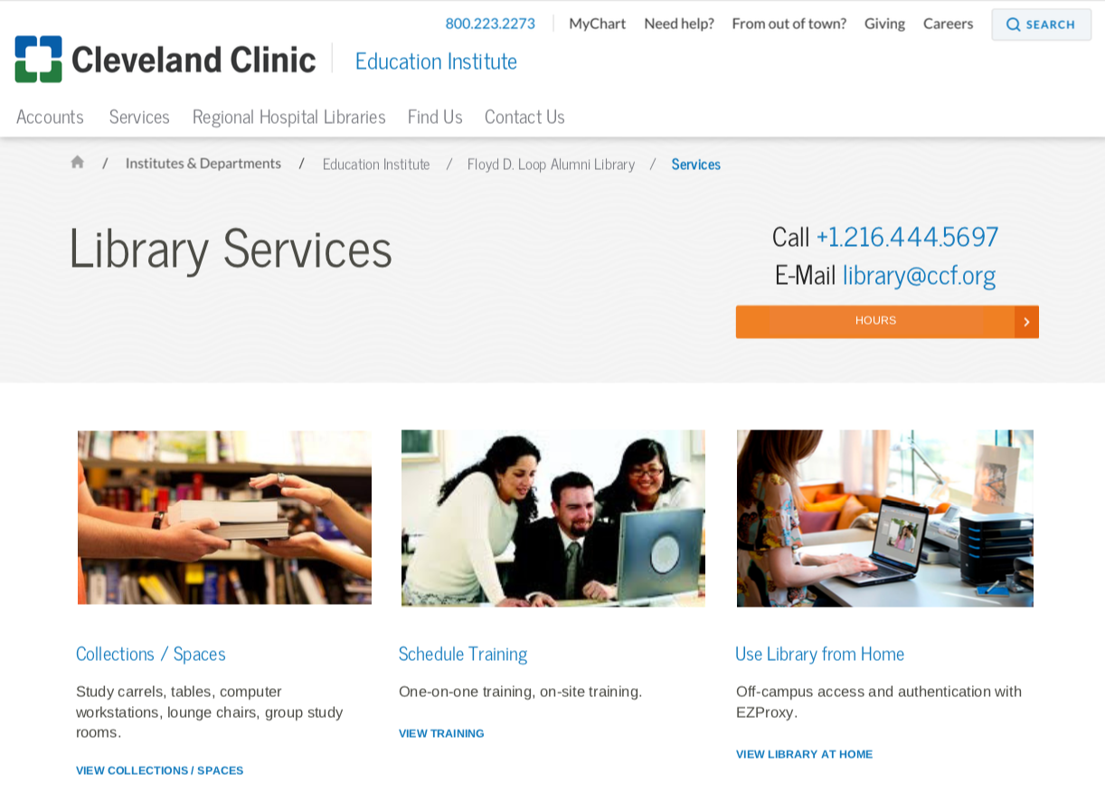

Website Usability
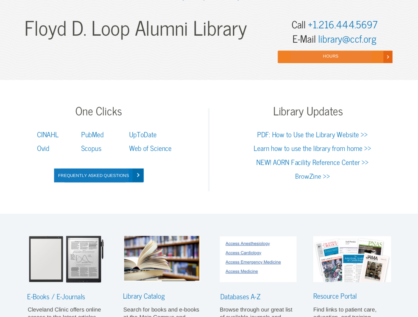
The main features of the website became easily navigable. The E-Books, Catalog, Databases, and Resource Portal sections now have clear and concise descriptions that guide the user to choosing the correct resource. Additionally, the One Clicks section features resources that both users and our website analytics noted as the most often clicked links. The Library Updates section is important for library staff to update users with new features and documents.
The library contact information is still featured prominently at the top of the page, in case visitors were to come to the website searching for that information. The library account information comes after these main sections on the homepage since my mentors noted its importance for repeat visitors, even though our data showed that other sections were used more often. Finally, the header features navigation to library services information, other hospital library pages, and driving information to the main library location. I chose each section in the main header navigation based on our focus group and user survey responses about the main reasons why people visit the library website.
In the future, the stock photos for each section must be updated and approved by Cleveland Clinic staff. Additionally, more information should be added to descriptions underneath confusing sections. One of the best parts of this site is its flexibility and ease in navigation for our users' most necessary tools, developed based on our user research.
